A Seamless, Personalized News Experience
A mobile app that lets users aggregate sources and queue articles for uninterrupted reading — putting users back in control.
My Role: UX Design, UI Design, Research, Prototyping
Tools: Figma, Pen & Paper
Team: Solo Project
The Problem:
Despite the abundance of news platforms, none allow users to queue multiple articles from diverse sources into a single uninterrupted reading session. Interviews and research revealed consistent frustration with app-switching, tapping, and loading delays.


Goals:
Empower users to choose sources and content
Enable passive, continuous reading
Simplify the mobile news reading experience
User Research
10 Participants | Ages: 23 - 54 | Mix of casual readers and heavy news consumers
Methodology
Contextual inquiry — Observed users interact with their current news platforms
Semi-structured interviews — Focused on emotions, habits, multitasking, and app-switching
Card sorting (in later testing) — Helped understand how users categorize “interesting” articles
Affinity mapping — Synthesized recurring patterns
Key Insights
Fragmentation Fatigue — “I check AP News, than Fox local news, then CNN. Its like hunting for stories”
Users jump between 2-4 platforms daily
High cognitive load from switching between apps and formats
No sense of continuity — everything feels disjointed
Desire for Passive Reading — “If I could just tap once and keep reading… that’s the dream.”
Strong desire to queue articles and read hands-free
Most current apps interrupt flow: tap → load → back → next
Users often want to read the news while multi-tasking. Think newspaper and morning coffee.
Overwhelm & Clutter — “News apps throw everything at you — I just want the stuff I care about.”
Visual noise, irrelevant content, and aggressive notifications were major turn-offs
Preference for curated feeds from self-selected sources
Many wanted to feel in control of what they see
How It Shaped the Design
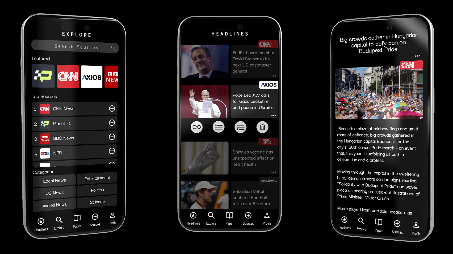
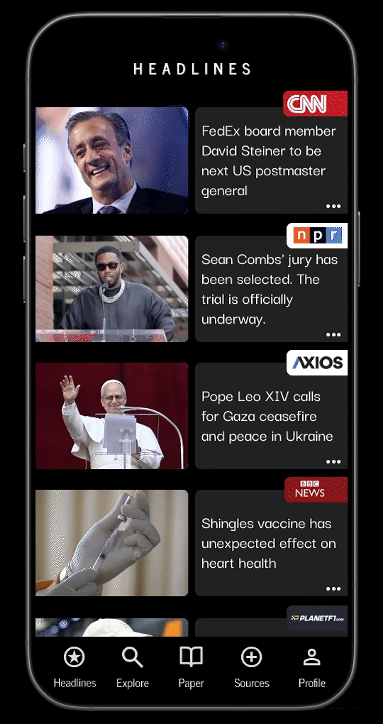
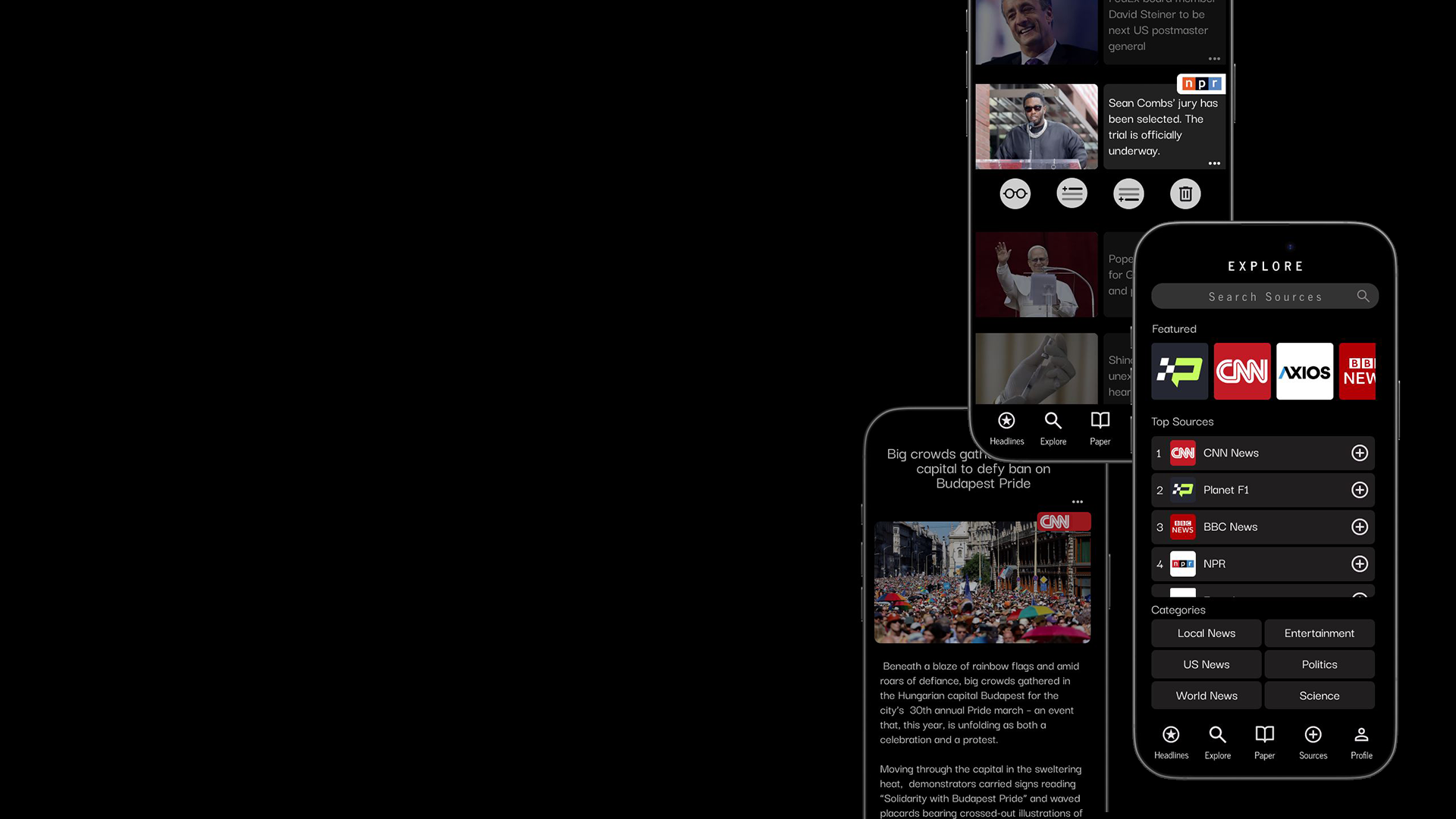
Queue Feature
Direct response to the need for continuous, passive reading. Mimics “Read Later” tools but built into the app’s core UX.
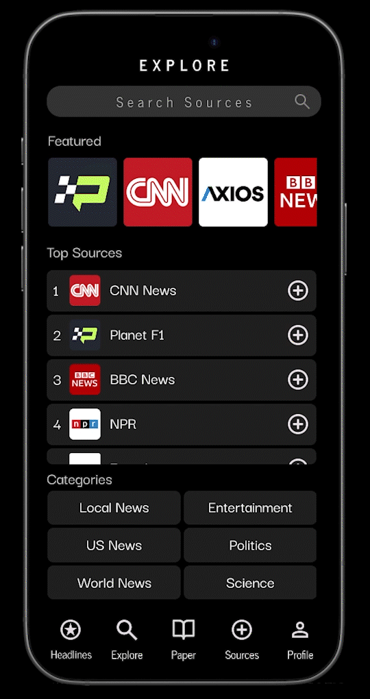
Source Aggregation
Users can add trusted sources instead of relying on a black-box algorithm — addressing concerns about clutter and bias.
Distraction-Free Reader Mode
Text-first, scroll-based experience that minimizes UI noise and aligns with the desire for clean, immersive reading.
Bottom-Up Navigation
Prototyped with thumb-first usability in mind, based on observed scrolling behaviors during testing.
Most competitor apps are content-first (news curation, editorial partnerships). This project is user-first — it’s driven by how people want to experience news, not how publishers want to deliver it.
This wasn’t about re-skinning a feed. It was about solving for a very real need — one supported by patterns, behavior, and emotion.

Design Process
Each iteration brought the design closer to what users actually needed — not just a prettier news app, but a radically more usable one.
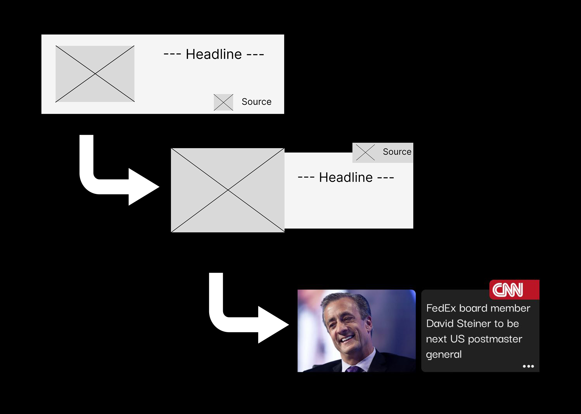
1. Sketches & Paper Wireframes
I explored multiple concepts for source management, article interaction, and navigation. This helped me iterate quickly without investing time in visuals, and spend more time in user testing.
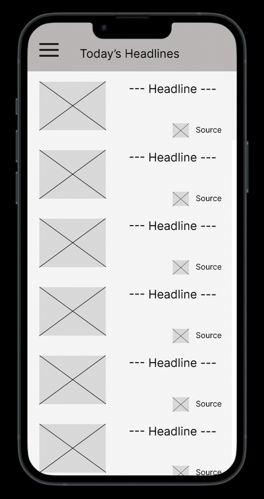
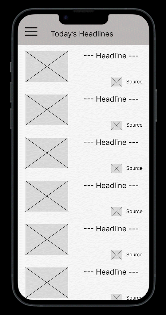
2. Low-Fidelity Wireframes (Figma)
I translated the best sketches into digital wireframes to test layout, information hierarchy, and user flow logic. These served as the blueprint for usability testing and early feedback.
3. Clickable Prototype
I built a mid-fidelity interactive prototype to simulate core actions like adding to queue, reading, and switching sources. This helped identify friction points in the user journey early on.
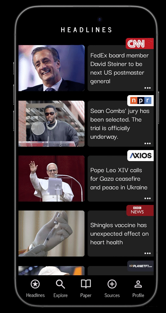
4. High-Fidelity UI
I polished the interface in Figma with a clean, type-forward design system inspired by real newspapers. The final screens reflect both functional UX decisions and emotionally calm design, rooted in what users wanted to feel — not just what they wanted to do.

Feedback & Iteration
From the start, I approached design as an ongoing conversation with users. Every layout, flow, and interaction was built on real behavior, real needs, and real feedback. This project wasn’t about making something beautiful — it was about making something intuitive, useful, and frictionless.
User Testing Process
I conducted multiple iterative testing rounds with users — some informal, some structured — using Figma prototypes at various fidelity levels.
Methods I Used:
Remote 1:1 sessions (moderated)
Unmoderated testing (via shared prototypes and post-task feedback forms)
Think-aloud protocols
Post-session interviews and surveys
Participants:
10 core users participated across 2–3 rounds each
Represented a range of tech comfort levels and news reading habits
Included users with accessibility needs, such as vision impairments and fine motor limitations, to ensure inclusive design decisions
UX Wins from Testing
Users understood the product’s value faster — from “I don’t get it” to “Oh wow, this is what I’ve needed.”
Time-to-first-read decreased by ~40% between initial and final prototype
Task success (building and reading from the queue) rose from 60% → 100% across iterations
Testers reported feeling “in control,” “less overwhelmed,” and “more relaxed” when reading
This phase confirmed my belief that great UX doesn’t come from assumptions — it comes from testing. The biggest improvements didn’t come from UI polish — they came from reducing confusion, reinforcing intent, and removing friction.
Outcome
A Validated UX-Driven Solution
The final version of Newspaper successfully addressed the core pain points uncovered in research: fragmentation, cognitive load, and lack of control over the reading experience.
Users immediately understood the purpose of the app and were able to use it effectively with minimal onboarding or instruction — a clear indicator of strong, intuitive UX design.
Measurable Impact from Iteration
Task Efficiency
Time to build a queue and start reading dropped by ~40% from the first to the final prototype
Users were able to complete core flows (add article → read → clear queue) with 100% task success in the final round of testing
Users reported they could quickly discover and add new sources from the Explore page, making it easier to customize their news feed before starting a reading session
Clarity & Satisfaction
In the first round, users were often unsure what the app was “for” — by the final round, testers could articulate the app’s value within 30–60 seconds
Users reported feeling “relieved,” “focused,” and “in control” — emotional responses rarely associated with digital news consumption
Accessibility Outcomes
Accessibility-focused participants confirmed the app’s layout, font sizing, and gesture options worked well for impaired vision and reduced dexterity
One tester with tremors said: “I didn’t feel like I was fighting the app.”
What Users Said
“This is the most relaxed I’ve felt reading the news in years.”
“The queue is a game changer. It’s like Spotify, but for news.”
“I’d pay for this. It’s like you designed it just for how my brain works.”
Still in Progress
The final prototype has been validated by users, but the project is still evolving. Future improvements under consideration:
Offline reading mode for commuting and travel
Smart article grouping based on topics or sentiment
Reading time estimation to help users prioritize their queue
Reflection
Growth as a UX Designer
This project challenged me to wear every hat — researcher, designer, tester, and product thinker — but I kept UX at the center of every decision. I learned how important it is to validate assumptions early, and how much clarity emerges from truly listening to users, even when the feedback is hard or requires major rethinking.
Through rounds of iteration, I saw firsthand that great UX isn’t about perfection — it’s about progression. Each change I made based on user insight made the app not only more usable, but more meaningful.
Lessons Learned
Feedback is fuel. The more I tested, the more I realized I couldn't design in a vacuum. Even the smallest insights often led to the biggest improvements.
UI doesn’t save a broken flow. A clean interface is meaningless if the experience doesn’t support user goals. I focused on building clarity, not flash.
Accessibility is not optional. Designing for accessibility early on made the app better for everyone. What started as a constraint became a powerful design driver.
Simplicity is a strategy. Saying “no” to features and trimming excess was key to making the product focused and usable.
This case study deepened my belief that UX is not just a deliverable — it's a mindset. It reinforced my commitment to human-centered design and showed me that the best digital products come from asking the right questions, not assuming the right answers.