

RepairUs makes fixing your devices fun, mobile, and community-powered
RepairUs is a mobile app designed to empower users to repair their own devices, keep electronics out of landfills, and push back against corporate-driven planned obsolescence. The app combines a library of repair guides with gamified features and a supportive community, making repair more accessible, engaging, and fun.
My Role: UX Design, UI Design, Research, Prototyping
Tools: Figma, Pen & Paper
Team: Solo Project
The Problem:
Most repair guides live on desktops, and laptops—exactly what many users don’t have when those devices break. Without mobile-friendly, beginner-supportive tools, repair feels intimidating, and too many devices end up in landfills.
Goals:
📱 Mobile-first repair → Guides accessible on phones/tablets when primary devices are down.
💬 Supportive community → Space for experts + beginners to share, ask, and learn.
🎮 Gamification → Points + levels make repair fun and motivating.
📖 Clear guides → Step-by-step, visual instructions approachable for all skill levels.
📂 Device collection → Personal library of devices + repair guides in one place.
♻️ Environmental impact → Show repairs saved from landfills and CO₂ reduced.
✊ Empowerment → Help users fight planned obsolescence and extend device life.
User Research
25 experienced repairers → Familiar with repair culture, and often contributors to online forums.
10 beginners → New to repair, eager to learn, but lacking confidence.
Accessibility-focused participants → Participants with visual or motor accessibility needs to test guide legibility and navigation.
Methodology
Interviews → In-depth 1:1 interviews with both experts and beginners to uncover motivations, frustrations, and expectations.
Surveys → Collected quantitative data on device ownership, repair frequency, and barriers to repair.
Task observation → Watched users attempt simple repairs with existing online guides, noting breakdowns in usability, language clarity, and navigation.
Card sorting & flow testing → Participants helped shape how categories, search, and navigation would be structured.
Key Insights
Desktop-first guides don’t match real behavior → Users often attempt repairs away from computers, making mobile-first design essential.
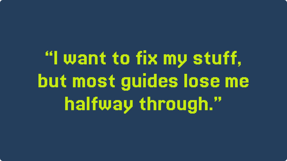
Confidence is the biggest barrier → Beginners often stopped repairs midway due to unclear steps or lack of community support.
Experts want efficiency → Power users valued fast search, model-specific filters, and minimal friction when accessing guides.
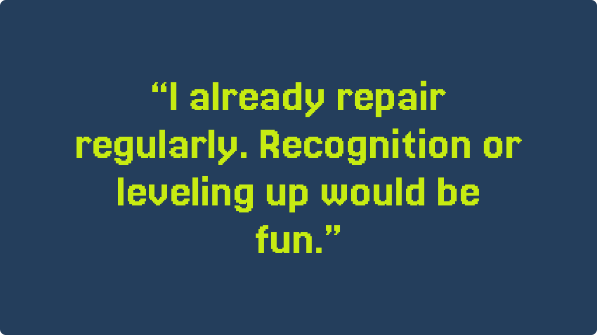
Community motivates action → Both groups said they’d feel more empowered with peer support, Q&A, and recognition for contributions.
Accessibility is critical → Users asked for clear visuals, scalable images, and minimal clutter to reduce cognitive load
How It Shaped the Design
A mobile-first app to solve the device-access gap.
Step-by-step visual guides to boost beginner confidence.
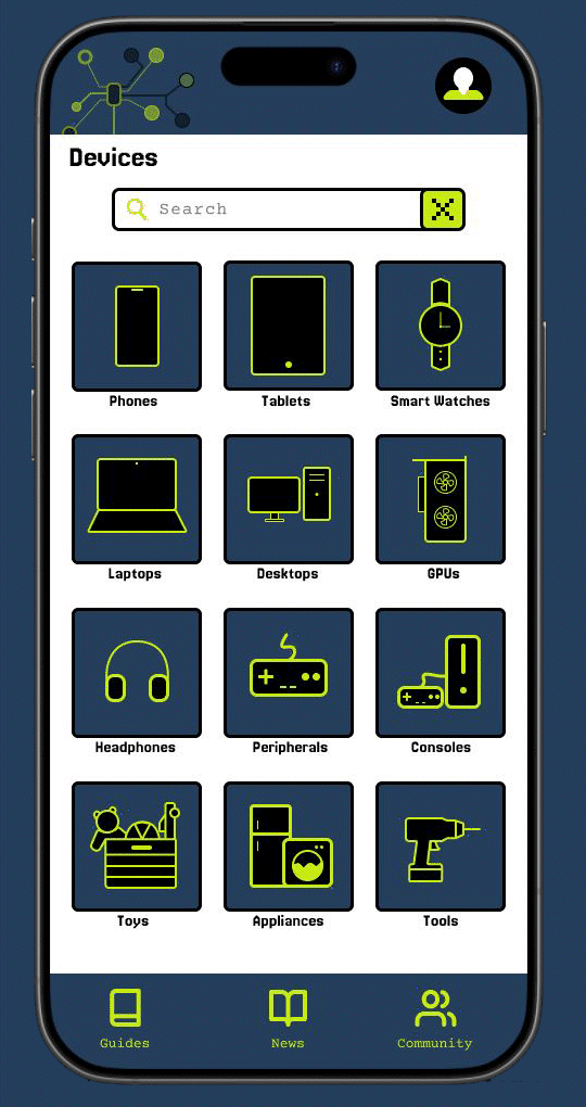
Dual navigation system (categories + search) to satisfy both casual and expert users.
A gamified community layer to increase motivation, belonging, and contribution.
Design Process
The design journey for RepairUs was highly iterative, moving from quick sketches to polished prototypes, always grounded in user input.
1. Paper Wireframes
Shared hand-drawn flows with participants for quick validation.
Early feedback → “steps need to be visual,” “profile stats should be more prominent,” and “I need both search and categories.”
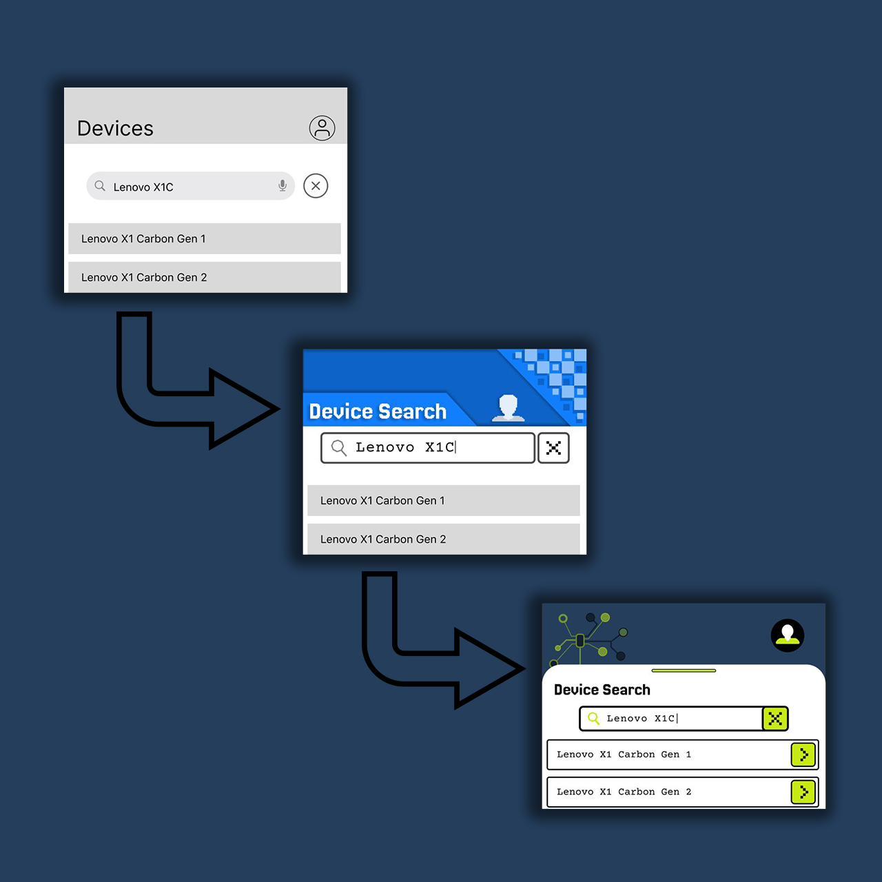
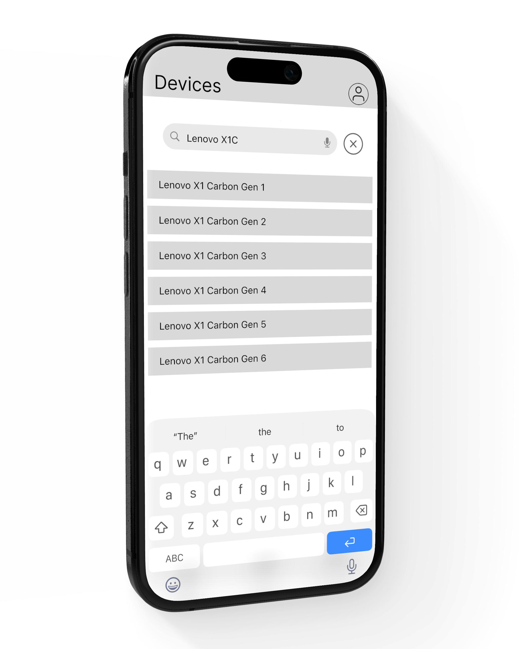
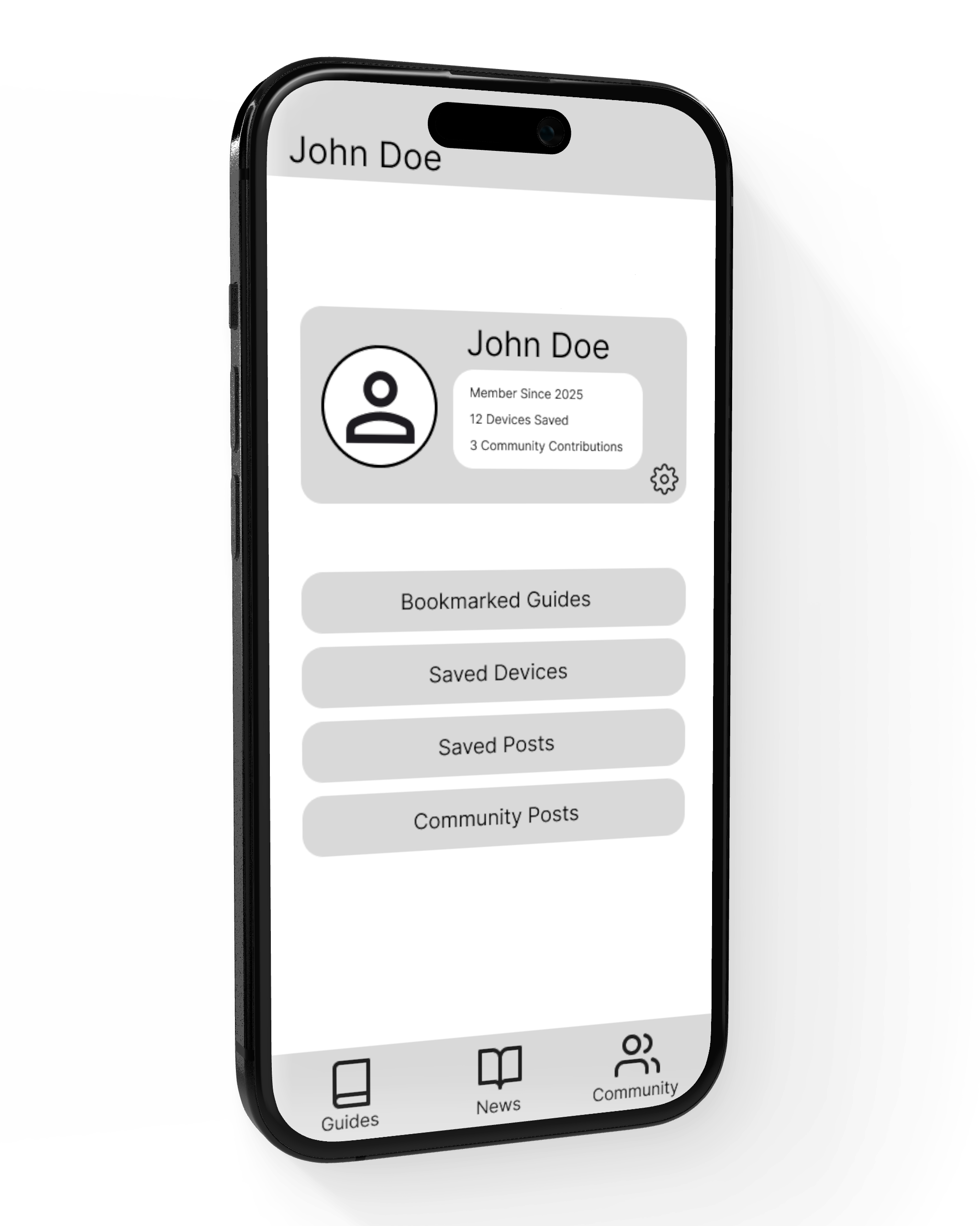
2. Low-Fidelity Wireframes (Figma)
Translated sketches into grayscale wireframes in Figma.
Focused on structure: navigation menus, guide layouts, community posting, and points system.
Tested clickable low-fi prototypes with users to refine flows before adding detail.
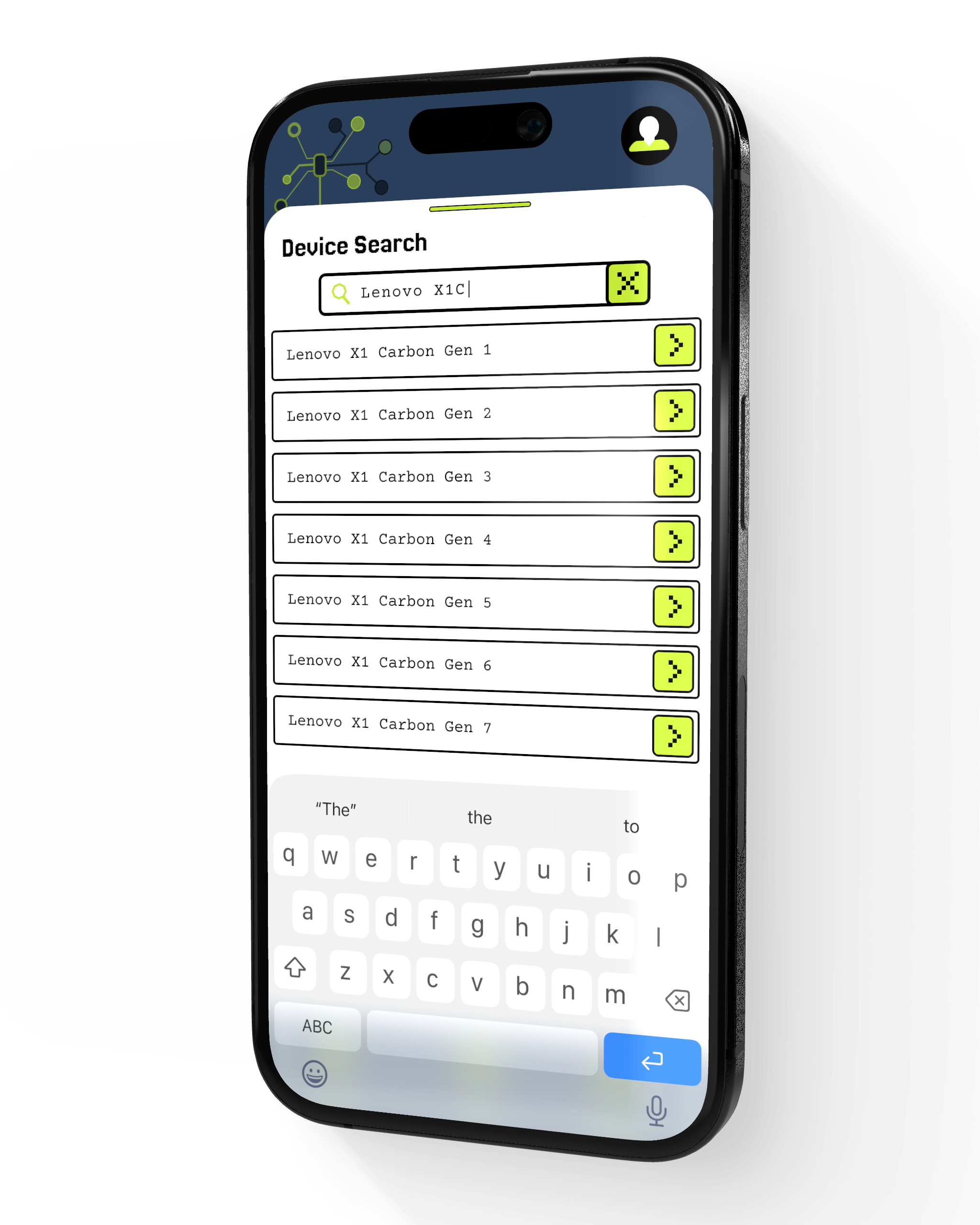
3. High-Fidelity Mockups
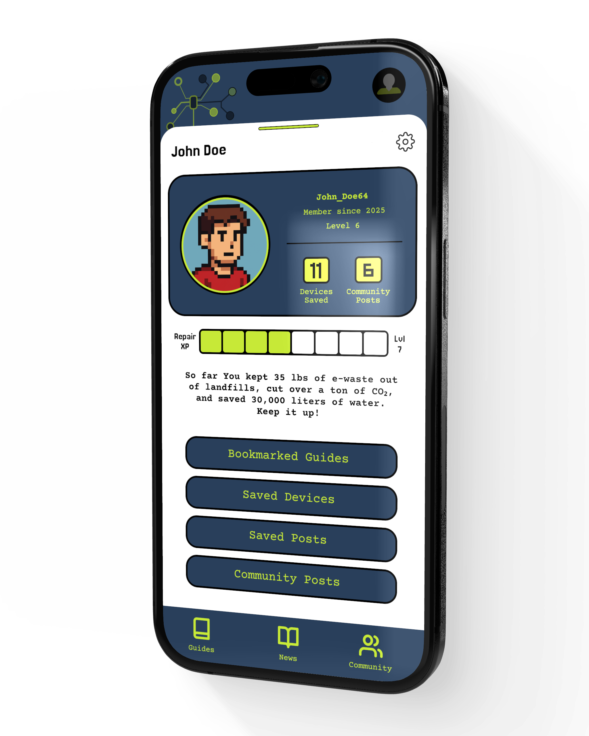
Developed a full visual identity with an 8-bit, video-game-inspired aesthetic based on strong user preference.
Designed pixel-style icons, avatars, and UI elements in Illustrator and imported them into Figma.
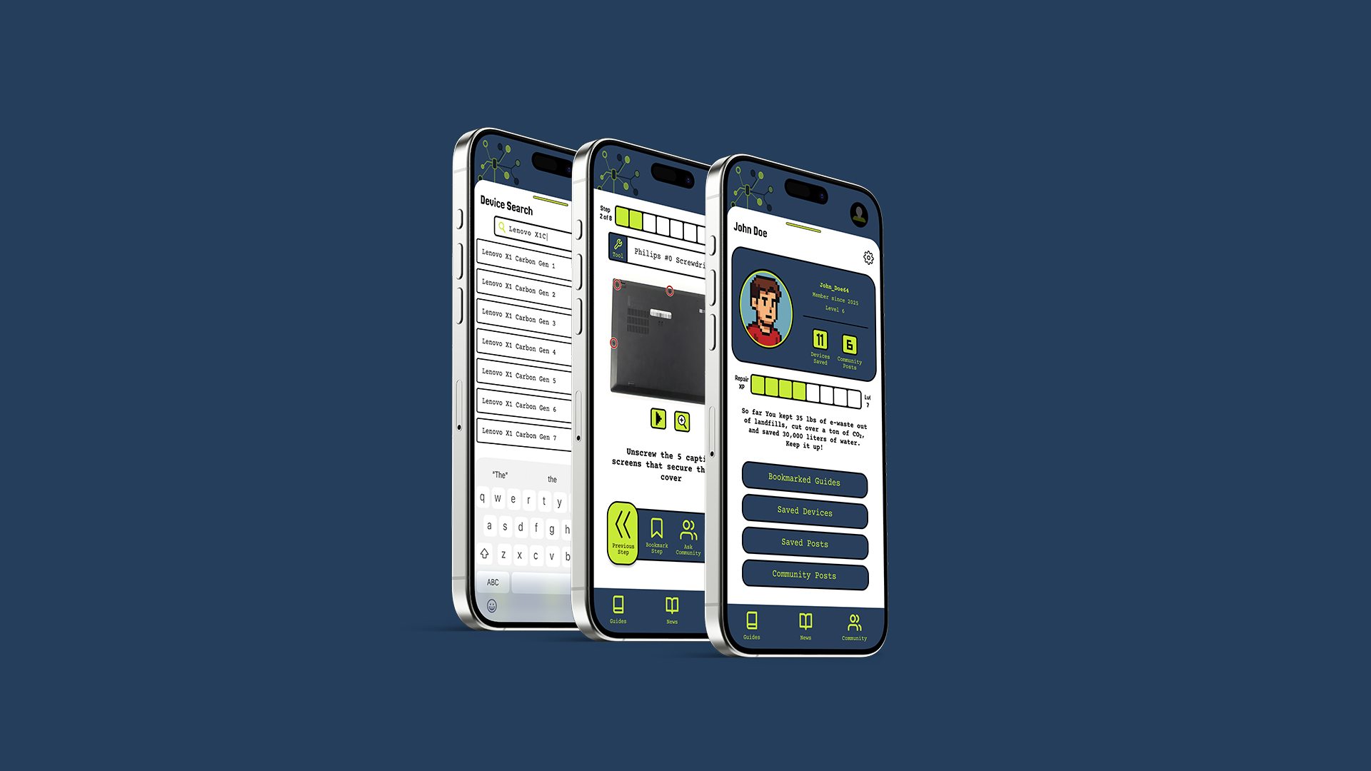
Delivered a polished prototype showcasing all key flows: device search, step-by-step repair, profile with environmental stats, and community Q&A.
Feedback & Iteration
User feedback wasn’t an afterthought in this project — it was the driving force. From the very first sketches to the final high-fidelity mockups, I continuously tested, gathered input, and refined the design
Early Testing (Paper Wireframes)
Participants were shown hand-drawn flows to react quickly and cheaply to concepts.
Feedback revealed that:
Step-by-step instructions had to be visual, not just text.
Profiles needed to showcase points, levels, and environmental impact upfront.
Users wanted both categories (to browse) and search (to go directly).
Low-Fidelity Prototypes
Clickable grayscale prototypes in Figma were tested with the same participant pool.
Feedback led to:
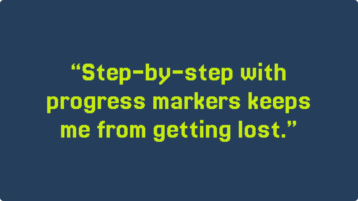
Adding a progress bar so users knew how far they were in a repair guide.
Added call-to-action placements encouraging users to ask the community.
Refined labeling + icons in low-fi screens to help users quickly distinguish repair difficulty and estimated time.
High-Fidelity Iterations
Participants responded strongly to the 8-bit, game-inspired aesthetic — a direction I wouldn’t have pursued without testing.
Feedback cycles refined:
Iconography (some icons were too abstract and had to be redesigned).
Accessibility (increasing font size, improving color contrast).
Guide layout (larger step images, clearer numbering).
Continuous Loops
Across all stages, I ran 3 full feedback cycles with 35+ participants.
Each cycle uncovered pain points and directly informed the next design update.
This approach ensured the final product was not just visually polished, but deeply usable, inclusive, and aligned with real user needs.
Outcome
The final design of RepairUs is a mobile-first repair companion app that makes fixing electronics approachable, engaging, and accessible.
Key Features
Mobile Repair Guides – Step-by-step instructions with visuals and progress tracking, built for on-the-go use.
Gamified Experience – Points, badges, and impact metrics (e-waste saved, CO₂ reduced, money conserved) make repair rewarding.
Community Hub – A space for users to share guides, offer support, and learn from one another.
Personalized Dashboard – Tracks repairs, saved guides, and personal sustainability impact.
Accessible UI – 8-bit inspired aesthetic with high contrast, clean typography, and intuitive navigation.
What Users Said
💬 “I love that I don’t need a laptop to follow along — I can just use my phone while fixing my computer.”
💬 “The progress tracker makes me feel like I’m actually accomplishing something step by step.”
💬 “Normally repair guides overwhelm me, but this felt approachable and fun.”
💬 “The points system is genius — it makes me want to keep repairing just to level up.”

Reflection
RepairUs pushed me to grow creatively and technically. The 8-bit, game-inspired aesthetic was new territory, but user research showed it resonated, so I committed—hand-building icons in Illustrator and refining visuals in Figma for a consistent feel.
The biggest challenge was structuring navigation across thousands of devices. Iterative testing helped me balance searchable precision with browsable categories, creating an experience users described as fun and empowering. Future opportunities include AI-powered repair suggestions, stronger community tools, and partnerships with e-waste programs.
Ultimately, the project reinforced the value of iteration. Each feedback cycle drove meaningful improvements—from UI polish to major flow decisions—resulting in a product users found useful, approachable, and fun.